FoodMix started 30 years ago as a food and beverage-focused ad agency here in Chicago. In that time, the agency has stayed true to its core business and our promise to bring “Brand Love” for our food and beverage clients.
Food is fun. Food is enjoyment. Food brings people together to celebrate, connect. At FoodMix, we see an opportunity to bring this spirit to life through a brand refresh that reflects both our heritage and the fun that is food.
The food category has some of the best design out there. Fun, modern and colorful packaging is ever competing for our attention in every grocery store chain, aisle after aisle. The focus is on clean and fresh ingredients with a clean and minimalist design. We help brands compete in this space every day. Evolving is scary, but to be current, that’s what we must do.
With this in mind, we wanted to explore a fun, modern, and colorful way to position FoodMix. Our brand should reflect the clean look and approachable feel of the food and beverage category that we get to persuade people in.
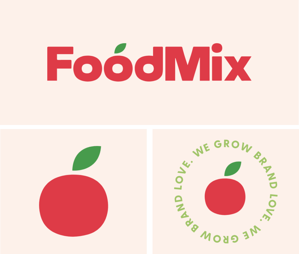
As we started thinking about this revamp, we were given a couple of non-negotiable pieces of direction. The first, from founder Dan O’Connell, was, “you have to keep the tomato.” Because our brand was evolving, our iconic mark needed to be more aligned with our brand strategy – Brand Love.
So…
Challenge 1: Find meaningful ways for the tomato to show up in both the logo and throughout the brand. Challenge 2: Our iconic mark needed to be aligned with the brand story.
Through research, we discovered that the tomato was once known as the Pomme d’ Amour – a powerful aphrodisiac used to win the object of one’s affection. This became our jumping off point for a focus on growing Brand Love. The new brand was reimagined.
The new logo is a modern twist on the original. It is reminiscent of food items with its round but imperfect edges and the shape of the “o” in FoodMix. Taller letters give a more friendly, quirky and inviting feeling. The tomato with its leaf is used as a shape and icon for other design elements.
We used colors that work well with our primary colors, red, green and light cream. The secondary colors combined to evoke that modern grocery feeling. The brand reflects all of the different food categories and beverage choices that we serve.
The illustrations use the shape of our tomato in their curves and turns. The icons reflect our passion for disciplined design and strategy that ladder up to our true purpose: growing Brand Love for our clients to their customer base.
Every single element is inspired by our heritage, our future, and our love for food and the brands that represent it.
We are FoodMix. We Grow Brand Love.
Interested in learning more about how we can support your food or food-related brand? Contact Us today.