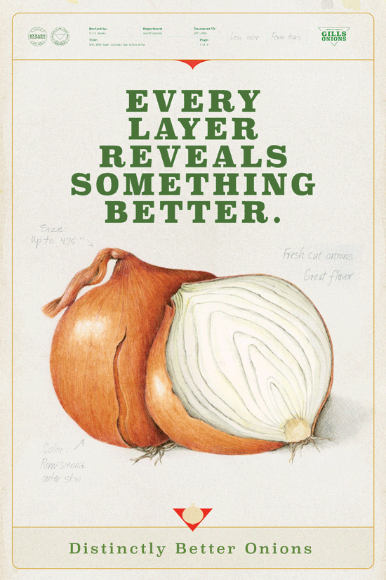
Distinctly Better Onions
Gills is fiercely devoted to cultivating a superior onion, from making them kitchen-ready, to growing them better, to achieving 100% sustainability. However, their corporate look hadn’t been updated in decades, and didn’t reflect their high standards. We set out to change that with ads that showcased their commitment to excellence. Ultimately, we helped foodservice operators believe in the Gills mission: to offer up a distinctly better onion.
Gills Onions
CAMPAIGN:Gills Onions
SERVICES:Strategy
Branding
Culinary
Ads
Posters
Website Design
Social
PR
Foodservice
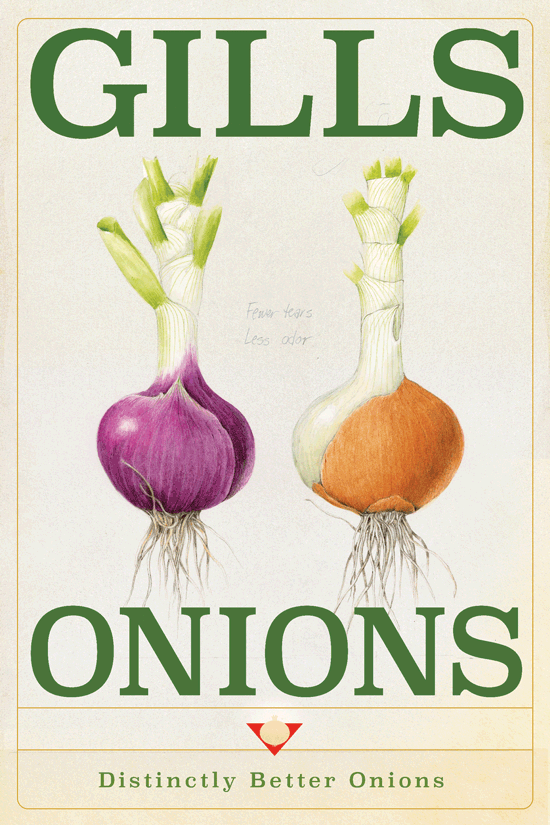
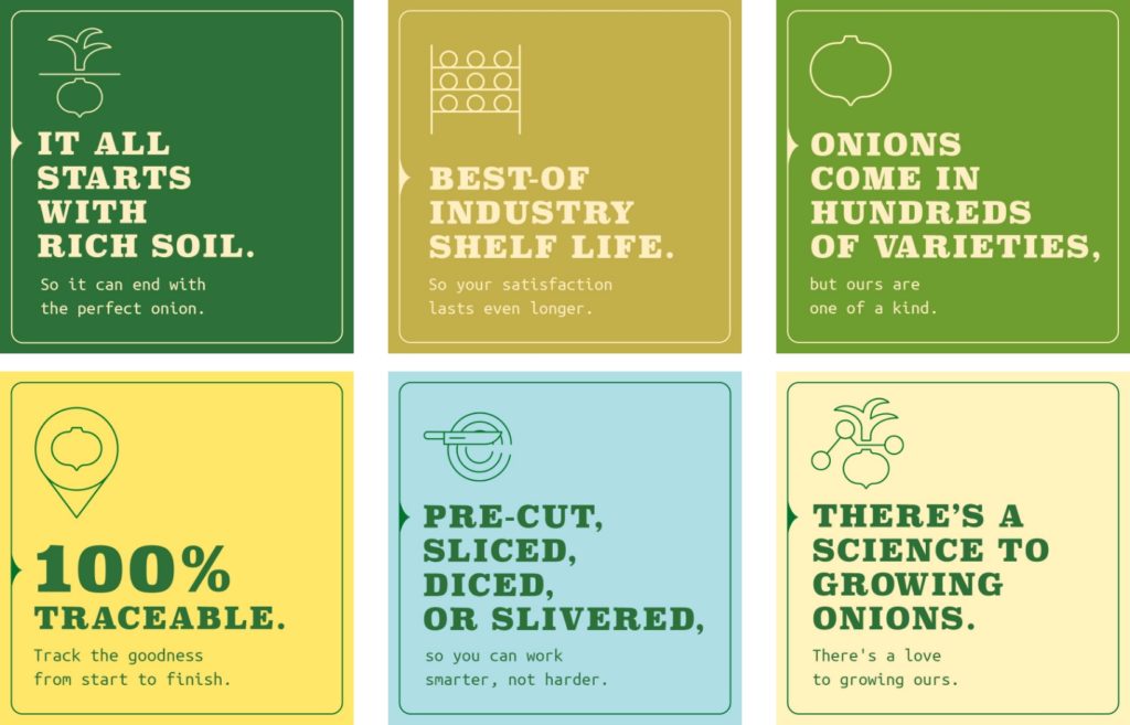
The color choices for the Onionology campaign were inspired by past and future. The past is “rooted” with greens, and the future is represented by the yellows.
To go in depth: the duo chromatic color scheme represents the two sides of the company. The sustainable, eco-friendly side of the company (green) is devoted to creating the best onion and treating the land well. And the processing and shipping, being crisp, clean and refined, is represented by cream and yellow.

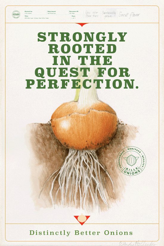
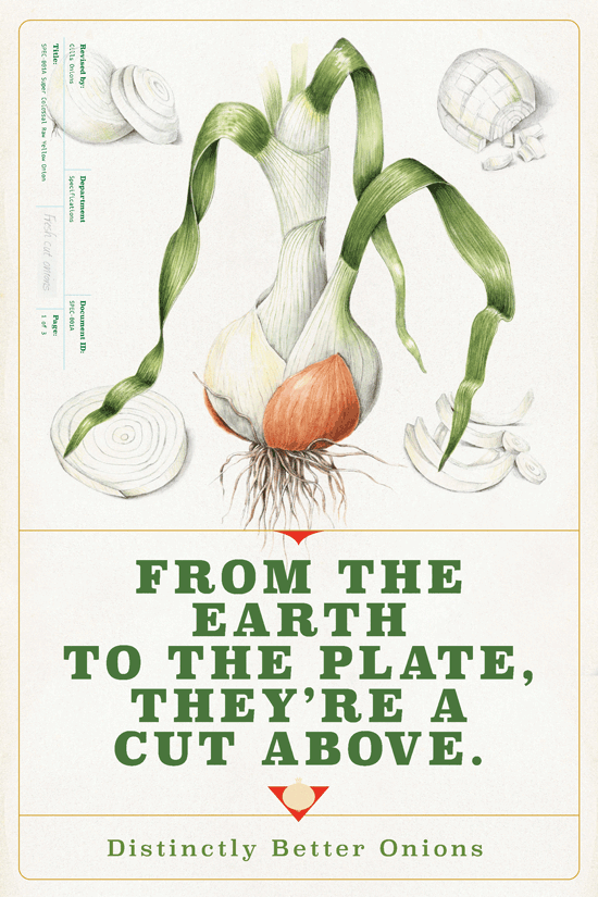
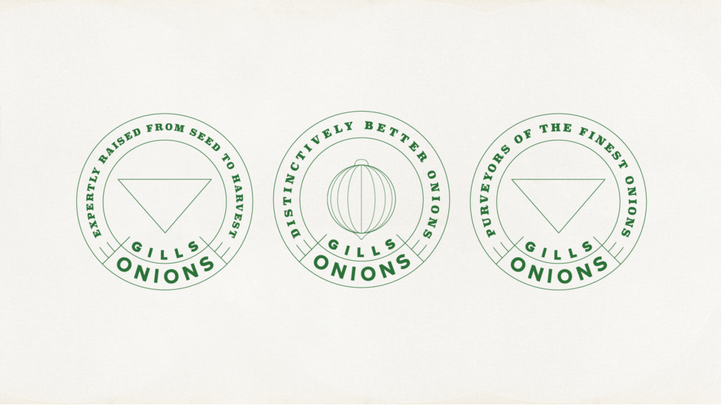
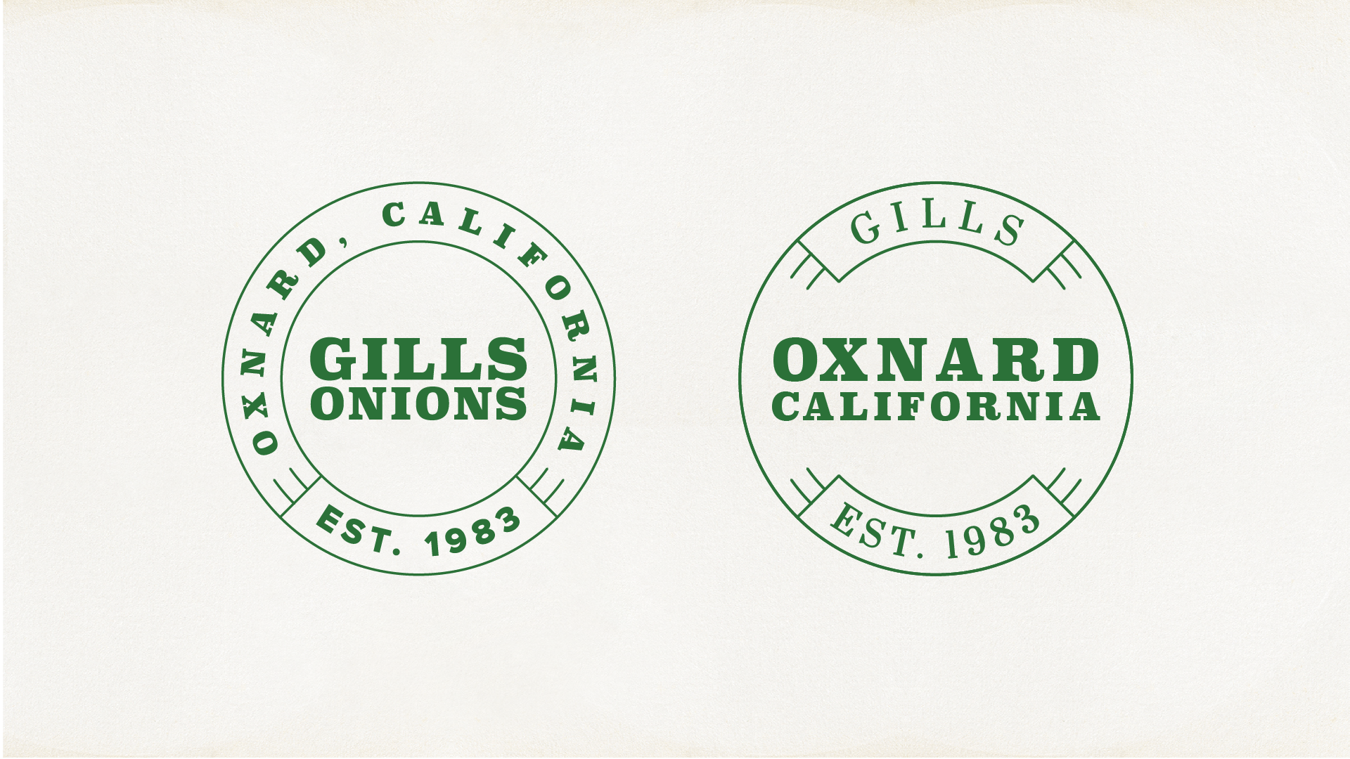
Stamps and marks are a signature of the study of botany. They allowed us to create a mark relevant to our messaging, but also add some design flair that helped elevate the look.
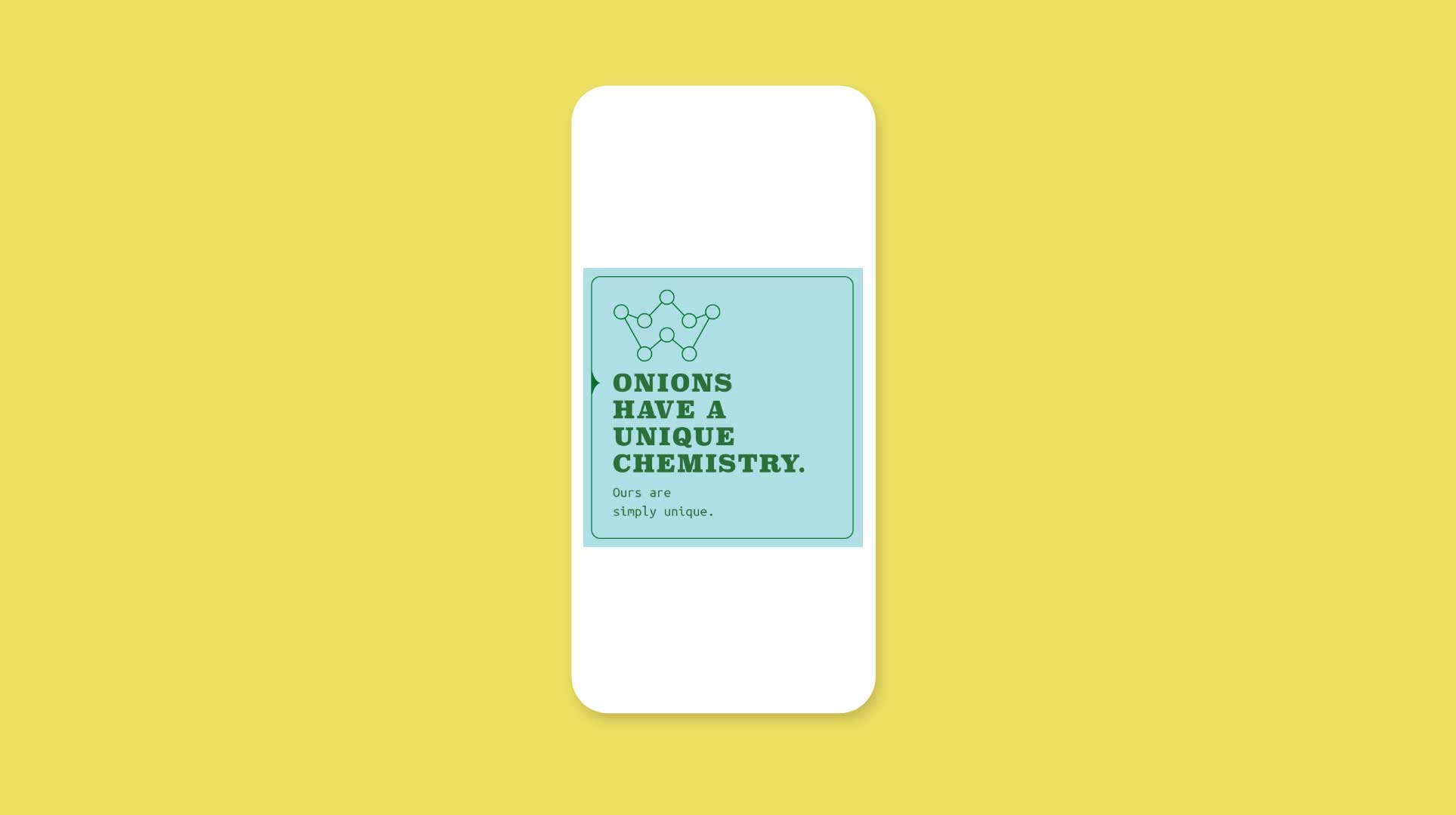
Our social media brought our messaging to the operator world via social platforms, to create that “pull” to drive buying decisions in an interactive way.